he Button Widget helps you easily design and customize buttons without the need for any other plugins or shortcodes.
Content
- Type: Select from 5 styles of buttons to begin your design. Choose from Default, Info, Success, Warning, or Danger
- Text: Enter the button’s text
- Link: Set the URL for the button’s link. Click the cog to set the link to either open in a new window or to add rel=nofollow to the link
- Alignment: Align the button to the left, center, right, or justified in relation to its column.
- Size: Select the preset button sizes, from Extra Small to Extra Large (see padding default details at the bottom of this document)
- Icon: Select a FontAwesome icon to display on the button
- Icon Position: Set the icon to appear before or after the button text
- Icon Spacing: Adjust the amount of space between the icon and the button text
- Button ID: (Optional) Assign a unique button ID to use for situations such as Google Analytics events
Style
- Typography: Change the default typography options for the button’s text
- Text Shadow: Add a shadow and blur to the button’s text
- Text Color: Select the color of the button’s text
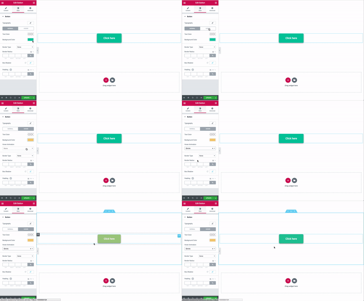
- Background Color: Select the button’s background color for both Normal and Hover states
- Hover Animation: Click on the Hover tab to set a Hover Animation
- Border Type: Select the type of border to use around the button
- Width: Control the thickness of the border around the button
- Color: Choose the border’s color
- Border Radius: Set the border radius to control corner roundness
- Box Shadow: Set options to apply a box shadow on the button
- Padding: Change the padding settings of the button

