How To Adjust Settings For Mobile, Tablet, and Desktop
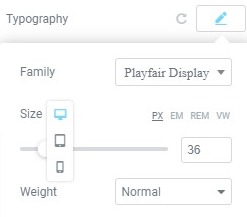
Many editable features have a Mobile, Tablet, and Desktop settings. Most common uses include: Text size, Margin and Padding of elements etc.
- Look for the Viewport Icon
 next to the individual element you wish to control.
 - Click the specific device icon for which you want to edit its settings.

Controlling Responsive Background Images and Borders
Background images in Elementor are automatically device-responsive, but you also have control over more options for each device.
- Background Image: You can choose a different background image for each device if needed, whether it is a size-appropriate version of the same image, or a completely different image altogether.
- Background Image Display Options: You can select a different image position, attachment, repeat, and size for each device. In this way, you have more control over which area of the image is displayed on different device sizes.
Visibility
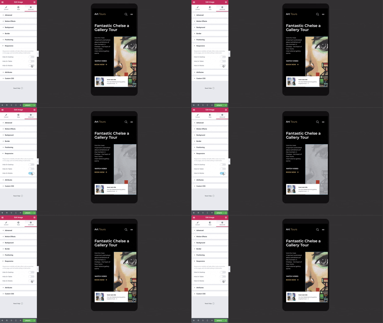
You can choose to Show / Hide a Section according to the device.
- Go to Section Setting > Advanced > Responsive
- Set your visibility preferences, choosing from Hide on Desktop, Hide on Tablet, or Hide on Mobile.

When hiding an element, and switching to the view it’s hidden on, you will see that this element is “muted”. This gives you a clear indication that this element will be hidden on the live site, but still enables you to edit it as needed.
You can edit that specific area in the responsive mode in which it is not hidden. For example, if the element is visible on mobile but hidden on desktop and tablet, you will be able to edit the element in the mobile view.
Change Mobile & Tablet Breakpoints
You can set the mobile and tablet breakpoint values.
- Go to Elementor > Settings > Style Tab, and set the breakpoint value for mobile and tablet
- Save your changes
- Go to Elementor > Tools > General Tab > Regenerate CSS, click Regenerate Files
Columns Ordering
This feature reverses the ordering of columns.
To use Columns Ordering go to Section Setting > Advanced > Responsive > Reverse Columns and set it to Yes.
Device Preview
Switch between Desktop, Mobile or Tablet views by clicking on the corresponding icons on the bottom of the panel.
Help! I Changed Something While In Mobile Preview, And It Changed On Desktop Too! Why?
- You can’t delete an element (widget, column, or section) while previewing one mode (mobile, for example), and expect it to only be deleted from that type of device. Deleting elements will delete them across all devices. You can, however, use the element’s Responsive Visibility feature by going to the element’s Advanced > Responsive tab and enabling any of its visibility options (Hide on Desktop, Hide on Tablet, or Hide on Mobile). While the element won’t be deleted on those devices, it will be hidden.
- You can’t move elements around while previewing one mode, and expect them to only be moved for that type of device. Moving elements around in any preview mode will move them across all devices. One exception to this is the Section > Advanced > Responsive > Reverse Columns feature, which does move columns to their reverse position.
- If an element doesn’t have a Viewport Icon
 next to it, changing that element in one preview mode will change it across all devices.
Did this answer your question?
